
Pretty in Pink: How to Use Pink in Interior Design
Pink has officially stepped beyond nurseries and little girls’ bedrooms—and it’s here to stay. When used thoughtfully, pink can feel elevated, inviting, and surprisingly versatile. From soft blush tones to deeper, moodier hues, pink brings warmth and personality to interiors without overpowering a space.
At Inspired Spaces Interior Design, we love helping clients embrace color in ways that feel intentional and timeless. Here’s how to incorporate pink into your home with confidence.
Why Pink Works in Interior Design
Pink is inherently warm, which makes spaces feel comfortable and approachable. It pairs beautifully with both neutrals and richer tones, allowing it to adapt to a wide range of styles—from traditional to modern, and everything in between. The key is choosing the right tone and balance.
Depending on the shade, pink can:
Soften a space
Add subtle character
Create a calm, welcoming atmosphere
Act as a neutral with personality
Choosing the Right Shade of Pink
Not all pinks are created equal. The undertone and saturation matter just as much as the color itself.
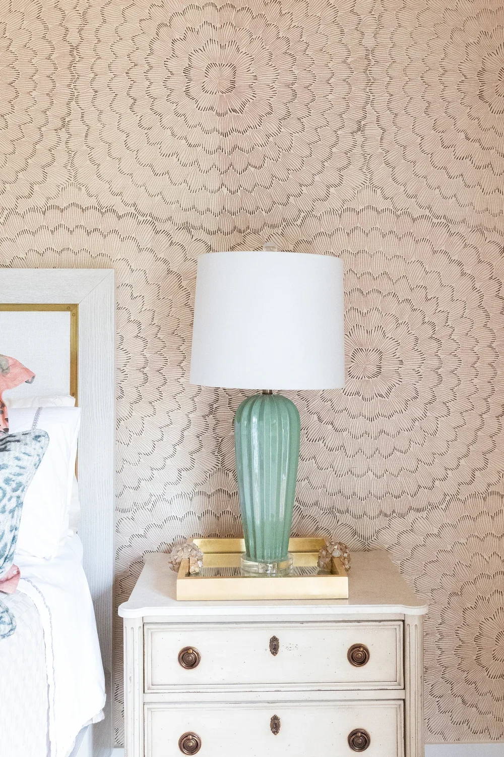
Soft blush & pale pinks: Ideal for walls or larger surfaces. These shades act almost like a warm neutral and work well in living rooms, bedrooms, and dining spaces.
Dusty rose & muted mauves: Perfect for adding depth without feeling bold. These tones feel refined and pair well with natural textures.
Deep rose & terracotta pinks: Best used in accents or smaller areas where you want impact without overwhelm.
Where Pink Shines Best
Living Rooms: Pink walls or upholstery can instantly warm up a living space. Pair with layered textures, natural wood, and soft neutrals to keep the look balanced.
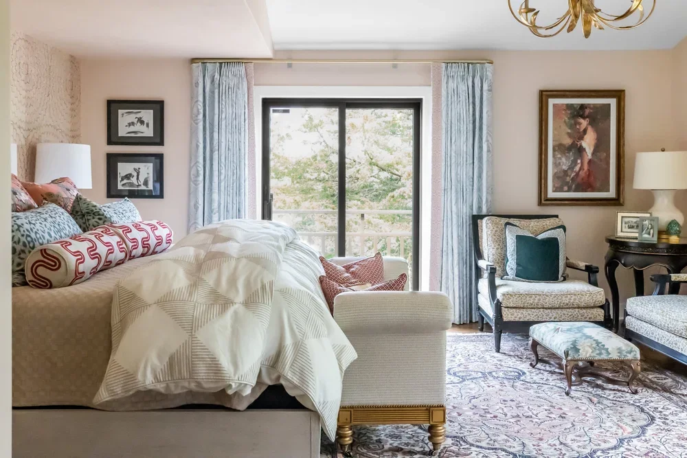
Bedrooms: Pink is especially effective in bedrooms thanks to its calming qualities. Soft pinks create a restful backdrop while still adding interest.
Kitchens & Bathrooms: Pink cabinetry, tile, or even subtle accessories can feel unexpected and elevated—especially when paired with brass hardware, stone surfaces, or crisp white finishes.
What to Pair Pink With
Pink plays well with a variety of materials and colors. These combinations help pink feel grounded rather than overly sweet:
Neutrals like cream, taupe, and warm gray
Natural wood tones for warmth and contrast
Black or deep charcoal for a more dramatic edge
Metallics such as brass or champagne finishes
Pink as an Accent Color
If committing to pink walls feels like too much, start small. This approach lets you experiment while keeping the space flexible.
Throw pillows or upholstered stools
Artwork with pink undertones
Rugs or window treatments
Decorative accessories layered with neutrals
Pink doesn’t have to feel trendy or juvenile. When chosen thoughtfully, it becomes a sophisticated design element that adds warmth, charm, and personality to a home. Whether you’re drawn to barely-there blush tones or richer, moodier pinks, there’s a way to make the color feel timeless and intentional.
If you’re ready to explore pink—or any color—in your home, our team at Inspired Spaces Interior Design would love to help you find the perfect balance.