
Romantic Color Palettes: Warm, Inviting Tones for Every Room
Color has the power to shape the mood of your home — and February is the perfect moment to lean into hues that feel warm, romantic, and deeply inviting. Whether you’re refreshing a single room or reimagining your entire space, choosing the right palette can create a sense of comfort, connection, and everyday beauty.

At Inspired Spaces, we love using color to bring out the heart of a home. These are some of our favorite romantic color palettes that add warmth, softness, and personality to any room.
1. Soft Blush & Warm Ivory: Elegant, Understated Romance
Blush isn’t just for Valentine’s décor — when used thoughtfully, it becomes a soft neutral that adds quiet warmth.
Why we love it:
It layers beautifully with creamy ivories and warm whites
It brings subtle color without overwhelming the space
It pairs perfectly with natural textures like oak, linen, or wool
Ideal for bedrooms, sitting rooms, nurseries, or anywhere that benefits from a soft, calming touch.
2. Deep Merlot & Dusty Rose: A Timeless, Moody Pairing
For clients looking for something richer, a palette built around wine tones offers softness with depth.
What makes it romantic:
The contrast between dark berry hues and lighter pinks creates visual drama
Works beautifully with brass, walnut, and matte black finishes
Adds warmth in colder months while staying elegant year-round
This palette feels especially at home in dining rooms, dens, and sophisticated bedrooms.
3. Warm Terracotta & Earthy Neutrals: Cozy, Organic Love
Terracotta continues to be one of the most-loved warm tones in modern interiors. Paired with earthy neutrals, it creates a grounded, cozy atmosphere.
Why it works:
Terracotta brings natural warmth without being bold
Layering creams, tans, and caramel tones keeps the room soft and timeless
These shades echo nature, making them easy to live with
Perfect for living rooms, entryways, and family-friendly spaces.
4. Muted Plum & Soft Gray: Understated Elegance
Plum doesn’t have to feel heavy. When softened and paired with gray, it becomes a serene, romantic palette with a slightly modern edge.
Designer tip:
Use plum in fabrics — think velvet pillows, drapery, or accent chairs — for a luxurious touch without repainting an entire room.
This palette works beautifully in primary suites, guest rooms, or quiet lounge spaces.
5. Candlelight Gold & Warm Taupe: A Glow-Up for Any Room
There’s something undeniably romantic about a golden, candlelit glow — and yes, you can create that feeling with color.
Why we love this combination:
Warm taupe grounds the palette
Soft gold accents (not shiny, but brushed or matte) add warmth and depth
Creates a welcoming, elegant atmosphere
Beautiful in foyers, dining rooms, and layered living spaces.
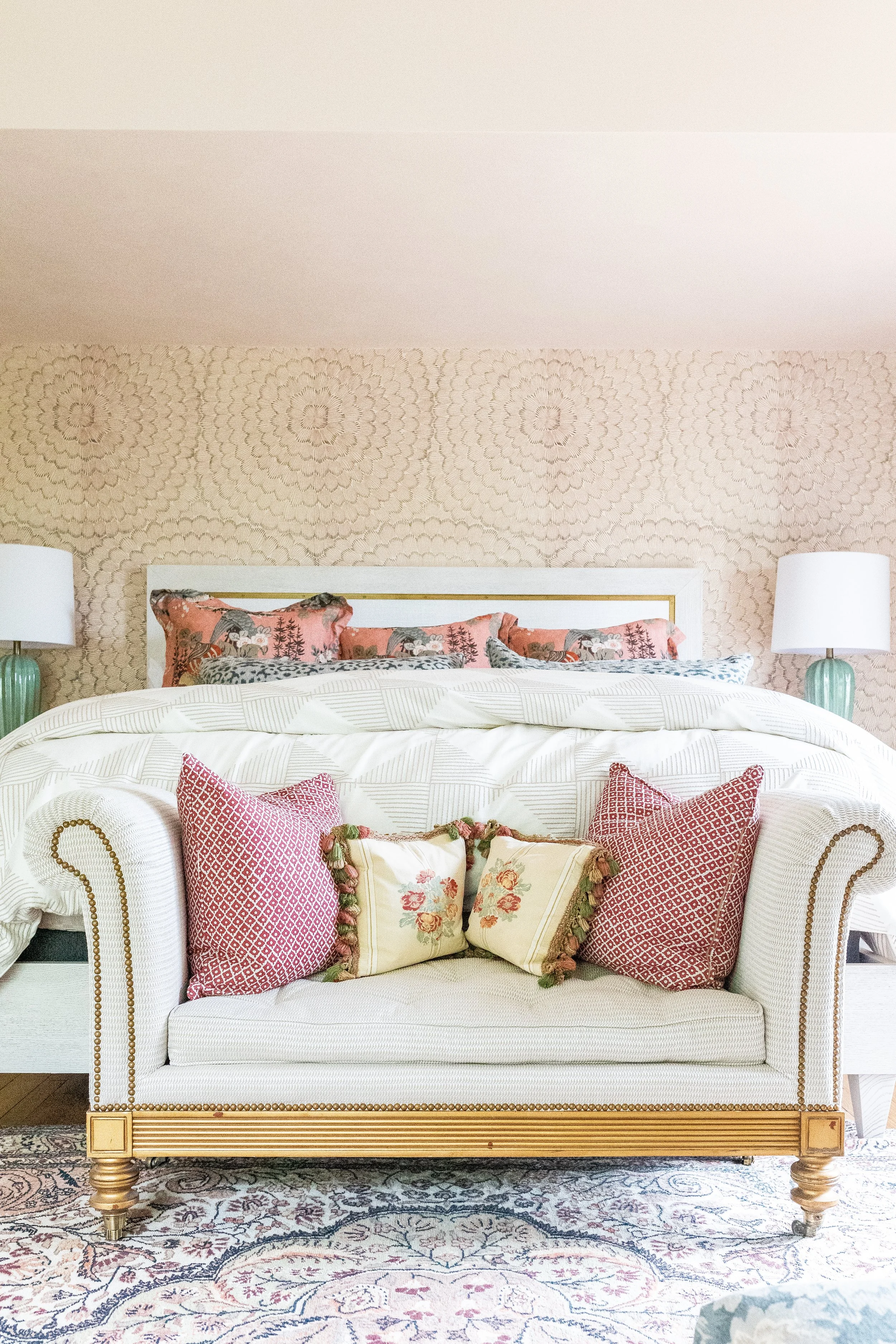
6. Classic Red… Reimagined Softly
While bright red can feel intense, muted reds — like clay, brick, or deep coral — bring a more refined, romantic energy.
Ways to use it:
Patterned throw pillows
Artwork featuring warm-toned abstracts or florals
Patterned rugs with subtle red threading
It brings a touch of passion in a way that still feels elevated and timeless.
How to Bring Romantic Color Into Your Home
You don’t need to repaint a room to embrace a warmer, more inviting palette. Consider:
Throw blankets in soft, luxurious textures
Pillows in warm florals, velvets, or linens
Framed artwork with warm, romantic tones
Candles, ceramics, or vases in blush, terracotta, or plum
Window treatments that soften light and add warmth
Small changes can shift the entire feeling of your home.
Create a Home You Love
Romantic doesn’t have to mean overly feminine or seasonal. These palettes bring warmth, comfort, and personality to your home year-round — and they’re a beautiful way to surround yourself with colors that make you feel good.
If you’re ready to refresh a room or explore a palette that fits your style, the Inspired Spaces team would love to help you design something beautiful, cozy, and uniquely yours.
Let’s create a home you’ll fall in love with every day!
